Toyota.com Responsive Redesign
Role: Experience Design Lead
Saatchi & Saatchi LA’s Experience Design team was tasked with the discovery, foundational research, recommendations and road map for Toyota.com’s “optimization.” We expanded the original scope of the assignment from a “lift and shift” to a full responsive redesign to best optimize and enhance the experience for our customers and serve the content from a single code base to reduce production time and ensure parity across all devices.
We assembled a small, agile team of creatives, technologists and producers, co-located in a war room for three+ months, and reinvented Toyota.com, one section at a time.
Our approach was to build all viewports in parallel, ensuring all relevant content was well-accounted for across the experience.
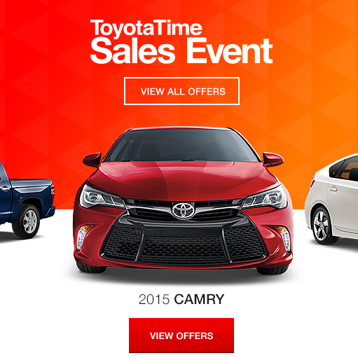
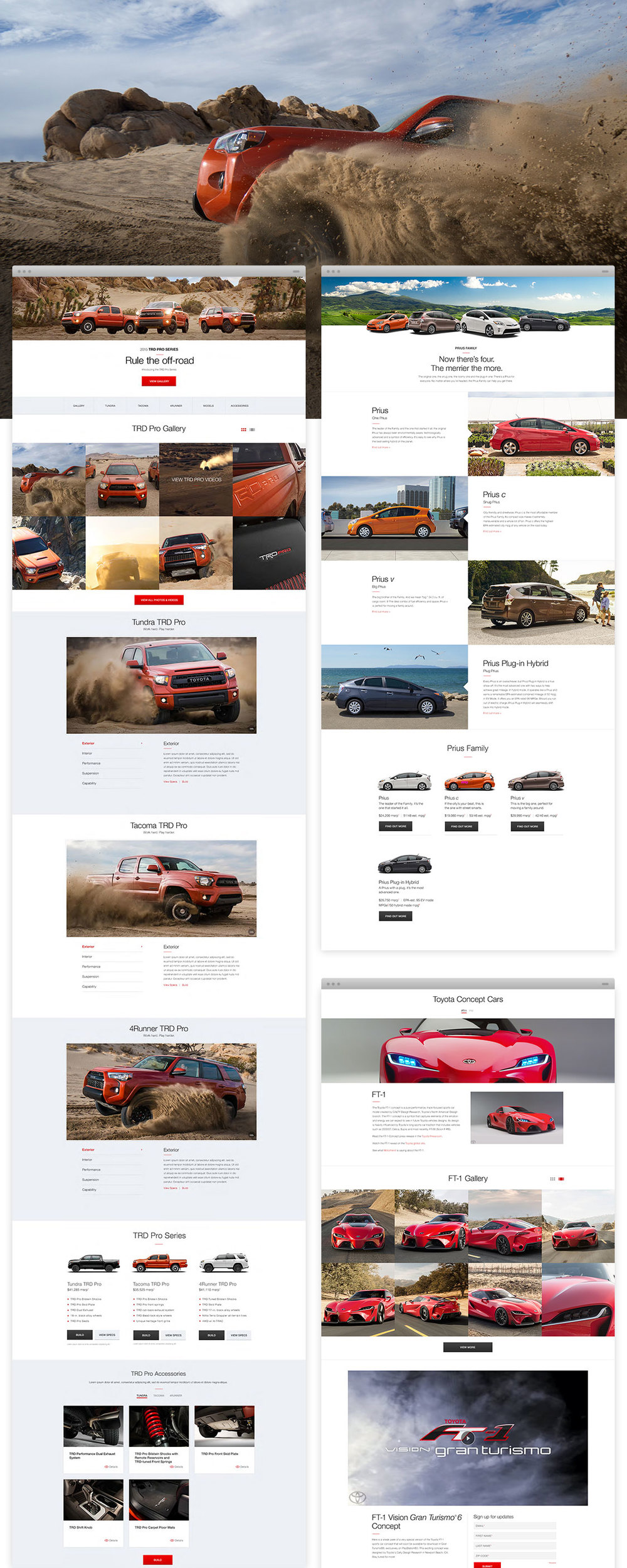
After careful consideration of the dependencies, ideal user experience and traffic patterns, we began with the “Global Elements” (navigation, footer, home page) then moved on to the Model Landing Pages for the 22 vehicle models. The page was broken down into "tiles" and we divided and conquered. We sketched, prototyped micro interactions, then segued into design and code rapidly.

Discovery Process and Experience Recommendation
This process was a collaboration across several departments, led by myself as Lead Experience Designer. We triangulated inputs from Digital Strategy, Content Strategy, Agency Insights, our Business Partners and Stakeholders and I synthesized the data to create the recommendation for the responsive redesign of Toyota.com. Thankfully, the client agreed and we quickly assembled our team and moved into our war room for the next 18 weeks.

The War Room
Where the magic happened. All our work was pinned to boards daily and we’d walk clients and stakeholders through to answer questions and show where we were and where we were going.

Sketches
We worked module-by-module starting with quick sketches.

Quick Iterations + Variants | Designing All Breakpoints in Parallel
We’d jam on designs both as a group and solo. We’d come together each morning to share what we had and talk about what would work best. Once agreed upon, the UI designers would take the wireframes and run with them while UX moved on to the next modules.

User Testing - Affinity Diagramming
What were some of our insights? As the Experience Design team’s hypothesis (and best practices) anticipated, the hamburger menu wasn’t recognized by all users. The alternate version was even less successful because it looked like an existing Android icon. In addition, the animation we used in our jump links was too abrupt. Easing into it to help users understand they were still on the same page, rather than on a new page, aided their way finding.

Annotated Comps

Final Designs
18 weeks of co-location in the war room with Experience Design, Visual Design and Developers resulted in a successful launch in record time. We moved on to Entune and Local Specials. Concurrently, I was also leading Camry All-Access.
Postscript
Key KPIs for the business such as qualified leads and contact a dealer and build finish all increased. User testing shows improved wayfinding and information finding. While most other major auto OEMs have 5 - 10% drop in sales, Toyota sales increased 1-2% after launch.
Explore more work